The Power of Symbols
When adopted by governing forces, allegorical signs are never benign
Minnesota has a new state flag design up for legislative approval once the new session convenes in early 2024. Here is a look at the new design (on the left) next to our current flag (on the right.) Symbols are important forms of communication. And as such, symbols should never be taken lightly. Because symbols convey powerful messages, companies and governments adopt them as part of their branding. The reason is a symbol, just like a picture, speaks a thousand words. Symbols invoke feelings, feelings lead to actions and actions lead to results. The question at hand is, what results do the new State flag creators wish to achieve?
Before we get to that weighty issue, let's perform a little test. Every one of these following symbols will invoke a reaction from those who view them. To some, the reaction may be positive. To others, the symbol may cause gut wrenching pain and discomfort. For instance, when I place this symbol before you, what do you feel?
This symbol split the American voting population nearly in half in the 2020 elections. In my lifetime, no campaign slogan ever had such an effective and dividing presence.
What do you feel when you view this symbol?
To some, the hammer and sickle is a powerful message of workers of the world uniting against the fat and sassy bourgeoisie. To others, it is the ultimate symbol of godless totalitarianism.
How about when it comes to religion? What do individuals feel when they see these symbols?
The images have significate meaning to the millions of followers of those individual religions but bring great angst to some who do not subscribe to the respective religious tenants.
Symbols are all about us. Companies adopt logos for the same reason. When one sees the following logos, they also invoke some positive or negative feelings.
If one is a supporter of one of these brands, they proudly wear their fandom on T-shirts, hats, and other paraphernalia. If one views these companies unfavorable, the symbol serves as a reminder to avoid their products.
In religious worlds, symbolism has been around longer than the written word itself. The Association of complex thoughts surrounding religious symbols is extensive. In ancient times, those symbols were carved in stone.
These emblems, carved in long-lasting stone, tell a story and remind their respective societies of their leaders’ glory.
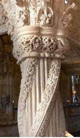
I've always enjoyed visiting old churches and cathedrals. The mastery of medieval stonework is awe-inspiring. But what I find most fascinating is the builders’ use of symbolism in their structures. Nowhere is that more evident than in the carvings of Rosslyn Chapel in Scotland. for centuries, scholars have been studying and attempting to translate all the symbols etched in stone in that unique 14th-century structure. One of my favorites is the Apprentice’s Column.
As the story goes, the master mason in charge of carving that column needed additional inspiration. He traveled abroad seeking the perfect design for his masterpiece. During his absence, a lowly apprentice carved the column. Upon the master’s return, instead of praising the young apprentice, the master in a fit of rage and jealousy instead bashed the apprentice’s head with a setting maul. The full Hiram Abiff antithesis legend regarding the apprentice’s column may be read here.
There are many more interesting and elusive symbols in that old chapel in Scotland. But the one thing that is for sure is, none of those images painstakingly carved into stone means nothing.
The same goes with our new, seemingly benign Minnesota State flag design. Although at first review, it looks as though its designers were trying to create something that so innocuous that it could offend no one. Its simplicity in design could not possibly displease anyone race, religion, sexual orientation, or political persuasion. Unless one has the rare colorblindness to blue, this seemingly simplistic flag design should appeal to all. At least that's what I believe its designers intended.
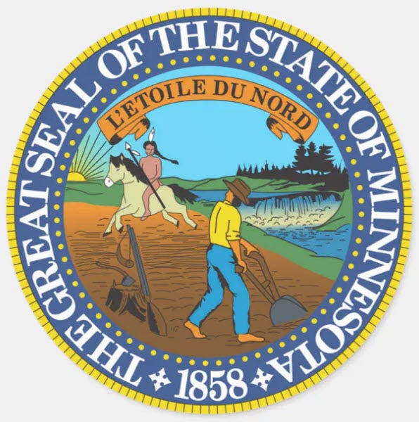
But as a potential symbol of my state, I see this flag design in a much different light. For starters, the current flag tells a much more descriptive story of Minnesota’s state inception and ultimate inclusion into these United States. The story the current flag tells is one of history, at least 150 years of history. That story is also emulated in the Minnesota State Seal.
Now, I understand that some are entirely bereft by what that story represents. The State of Minnesota, as well as the other 49 states of my union, are all stories of conquest. In the secular and progressive universities, stories of conquest are whittled down to the offensive term, "occupier." To those "enlightened" types, the current Minnesota flag symbolizes occupier. This new flag most certainly is intended to correct that abhorrent connotation.
But who designed this new flag? What symbolism did they intend to convey? Yes, I have read that the simplicity of the figure on the left is a childlike drawing of the shape of our state. The eight-pointed star is the new representation of our motto of the "North Star State." The varying shades of blue are supposed to represent the waters, which in the summer months are shades of blue. Easy peasy, right? Create a flag so simplistic with so few images that it can't possibly offend anyone. Unless of course, one is a symbologist.
If one looks at images the way one studies a Van Gogh, a Rembrandt, or a Picasso, they will see hundreds if not thousands of meanings in the flag's depictions. In many cases, what is omitted is more important than what is included. Here is my interpretation of my State's new flag design.
Let me start with the location of our state on the new flag. Whereas the seal on our current flag is placed directly in the center which conveys a sense of unity, the crude outline of the state of Minnesota is placed to the far left on the proposed new flag design.
This is to convey the message that Minnesota, politically speaking, is a left leaning state. It sends the message that the only unity one can expect in the State of Minnesota is the unity of leftist ideals.
Next, let's discuss the location of the eight-pointed star. My state motto is the North Star State. North is always depicted as the top part of any chart, map, or illustration. For this "North" symbol to be accurate, the star should have been placed near the top of the state image, say near the Red Lakes region. Yet this star is centered in the narrowest part of our state. This appears to emulate the location of St. Paul, my state’s capital. The placement of the star in this location has nothing to do with the direction "North" but conveys the message that all rule emanates from St. Paul. And, those counties, particularly outside the politically dominating Twin Cities Metro area, are subject to that rule.
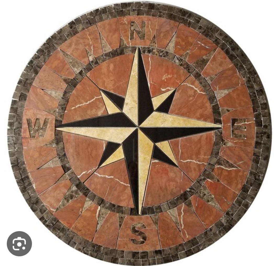
Regarding the star, the significance of eight points is also revealing. Its design resembles not the starburst –
the eight-pointed compass design, which one would use to depict the significance of the North but instead it resembles the eight directional image of chaos.
This star sign selection is far from unifying and could be seen as alternately destructive.
Perhaps the most disturbing feature of the proposed Minnesota state flag is the five-sided outline of the state. The Pentagon, with its five angles totaling 540° represents some of mankind's most destructive elements. For starters, it is no mere accident that our own military adopted a building in the shape of the Pentagon to fulfill its war duties. To be sure, message that building sends is not the image of a dove holding an olive branch.
College dissertations have been written about the evils of the number five. I will not delve too deep into the evil number five symbolism, but I will point out a few notable comparisons. Five refers to the five senses of sight, smell, hearing, taste, and touch. And although those senses help us to navigate and understand the world around us, they also are the conduit to our inter chambers by which lord nefarious imparts evil. Once one transcends beyond the five senses into the metaphysical, the devil has little toehold on their soul.
Five is the number of characters found in many words that connote evil. Most notable are satan and devil. But if one digs deeper into the words the dark lord uses to affect our five senses, words like death, pride, chaos, apple, fruit, beast, rumor as well as many more are in his lexicon utilized the gain access to our psyche. The choice of a five-sided pentagon as the states image certainly needs more explanation than what appears to be a simple sketch representation of my beloved state.
Finally, this proposed state flag of Minnesota lacks diversity. From the very simplistic five-sided shape to the use of merely two shades of blue, the flag fails to represent the diversity of the 32nd state. For starters, other than our southern border, the West, North and Eastern borders of Minnesota are far from straight lines. Notably missing is the bulge on the Western border beginning in Ortonville and then zigzagging its way north following the red River to the Canadian border. Absent across the Northern border of Minnesota is perhaps our most notable feature, the Northwest Angle that extends into Canada and the shared waterway known as Lake of the Woods. Also, as the border continues easterly across the Northern border, one cannot pinpoint precisely where International Falls is located which is significant as it is often listed as the coldest city in the lower 48. Finally, although the Eastern border is somewhat represented on the flag as the open-mouth of Pac-Man, it certainly fails to represent the significance of that border separating Minnesota from the cheese loving Wisconsinites. The significance of the barrier of both Lake Superior and the St. Croix River Valley in protecting our state from a green and gold invasion cannot be overstated.
With regard to lack of diversity, although some have indicated that the color scheme and star is somewhat like the national flag of Somalia, this proposed flag does little to signify the incredible diversity of my state. Although it is true that one of my state’s representatives is a landed Somali immigrant, and perhaps this flag was designed to appeal to that immigrant group, it overlooks many other ethnic groups that have made Minnesota their home. Including, but not limited to the largest concentration of Himalayan peoples in the United States. The proposed Minnesota flag also ignores native populations that were here prior to our statehood in 1858. Those peoples of the Dakota, Ojibwe, Ho Chunk, Cheyenne, Iowa as well as many other tribes are part of Minnesota's rich cultural history. However, it is possible that the Eastern border depicted on the flag is a shout out to these native tribes as it could also depict the forked tongue of a serpent. An image that Native Americans associate with the words and deeds of the white man that invaded their lands many decades ago.
As previously mentioned, one can gather quite a bit of information regarding a symbol. What's also important to note is what is absent in this flag design. Minnesota is a land of harsh climate filled with hearty souls that show great fortitude, especially in the face of hardship and defeat. Snowstorms that cripple southern cities for days at a time, are quickly shoveled and in mere hours residents are off to work, yoga classes coffee shops in no time. Also, as a state that has four professional sports teams with nary a national victory since the Minnesota Twins in 1991, this flag does nothing to show the resilience of its people in the face of constant disappointment. Minnesota is a state with one of the highest tax burdens while at the same time offering incredibly little to its residents who foot the bill. Yet the flag does nothing to depict those who are fiercely proud of their heavily burdening progressive ideals but cannot wait to retire to Southern climes and escape its massive tax inheritance cudgel.
Of course, I just dashed off these observations regarding the proposed state flag of Minnesota after a cursory review of the work. Perhaps, if I gave it more thought, I may see the nuanced positivity that I am sure this new design is intended to portray. No state adopting a symbol does so because it intends meaningless or superficial imagery. For my part, I truly wish to know what this proposed state emblem means to its creators and to the legislature conveyed to adopt it?


